Designing Effective Hero Banners
The two-second test
Unless you are a national brand and have become the “Kleenex” of tissue paper you need a great hero banner. Most visitors spend about 2 seconds on your homepage or landing page to decide if they are interested, or if they’re going to drop off. In most cases on loading your page, the first thing they experience is a hero banner.
Present your visitors a great first impression in these first few seconds with a hero banner that accomplishes a few key goals:
- Communicate what the company does.
- Reinforces why your brand is what they are really looking for.
- Prompts them how they can accomplish their own goals (buy something, contact you, learn more, etc.).
A great hero banner will combine headline, copy, and imagery to quickly and succinctly accomplishes these goals. Try to think of your hero banner in terms that it’s possibly the only promotion that someone will see and it’s the one time you can communicate your key message and desired action.
Let them “Get it ”
This speaks to the what your company is about. How many times have you gone to a company's website and can’t figure out what they actually do. Many service company websites lead with a hero banner choked with hyperbole or just plain ambiguous. You don’t want your visitors trying to figure out what the company or organization actually does.
Be authentic and use descriptive narrative content for headings, copy and buttons to create an understandable value proposition that speaks to your intended audience.
“Speak” to your audience
Authenticity about your brand speaks to the visuals as much as the headline. Not every client has the budget to have a professional photo shoot, but the worst thing you can do is grab a generic royalty free photo that’s used all over the web or a random background that says absolutely nothing about the product or service.
This is key to any effective marketing, the more specific you can get the better. The more you can “speak” to your target audience the better. Remember the headline is also used by search algorithms for SEO which will have extra benefits if you can include your audience or product keywords or phrases in the headline.
Your brand style comes across in your choice of words and imagery. You want things to “click” in more ways than one, don’t use language that causes a cognitive disconnect.
“You’re my hero! ”
That’s what you want to hear after you’ve combined a call-to-action that matches both your companies goals and your visitor's goals. This is what we call a successful conversion funnel. I’m going to review a few diverse yet very effective hero banners, each have a clear what, why and how.
STRAVA PREMIUM
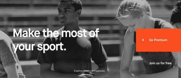
Banner for Strava Premium
- What: Headline reinforces the Strava Premium platform will help you be a better athlete, spoken to athletes for athletes.
- Why: Authentic looking amateur athletes checking their smartwatches and getting ready to seriously train clearly identifies why you need this product to track your training.
- How: The goals for both the visitor and the company are clear. This banner has three simple yet effective calls to action, the branded highlighted colored link prompts you
FRIENDSHIP FORCE INTERNATIONAL
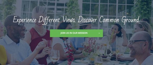
Banner for Friendship Force International
- What: Headline is the organizations' tagline, which happens to be their mission reinforcing travel for a purpose.
- Why: Middle-aged diverse group of people sitting around a family style dinner having fun in exchange of conversation reinforces the goals of the organization and deepens the headline.
- How: If the visitor's goals match the organization's goals we have a clear win-win. The drop-down button has a menu that links to the organization's 3 main goals, go on a journey, host a tour, and join a club.
HEADSPACE
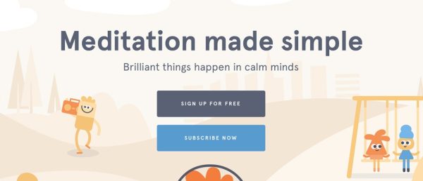
Banner for Headspace
- What: Looking at the banner you see a whimsical scene that recalls the simplicity of childhood, active yet calm characters. This is Headspaces goal, to provide a usable meditation app for active people. The headlines and imagery completely compliment each other while creating an emotional response.
- Why: If you find meditation difficult then Headspace provides you a simple solution that will work for you. The message is to give Headspace a try if you want to better your mind. This message appeals to those who most likely consider themselves smart and are looking to improve themselves.
- How: Headspace makes it easier for you to find out how to try it for free or go ahead and subscribe to the service.
Putting it all together
- Write clearly and succinctly about what you provide, avoiding ambiguity.
- Ensure your hero banner is genuine to who you are, uniqueness is rememberable.
- Remember your target audience and write as if you are talking to them.
- Imagery and headline should compliment and work together, avoiding a cognitive disconnect.
- Provide an actionable item that gives your visitors what they and your company are both looking to accomplish.
Your hero banner will be effective if it meets all of these requirements. Now that you have call-to-action you can verify and measure the effectiveness using event tracking analytics and monitor or iterate as necessary.
Coming soon: Next we will discuss some technical aspects of creating hero banners for responsive web design.