What makes a great looking website design?
Designing a website masterpiece isn't an easy task.
Website design in general is highly subjective and one persons ‘wow’ design is another persons ‘blah’. Trying to figure out what a client will like while maintaining your own design principles can be tough at times, if you bend too much you can end up with something that you’d rather forget, but with good clear client communication about your design decisions you can create a win-win.
A great way to start without spinning your wheels is a mood board, an organized display of thoughts and ideas for your web design project. This will be a useful tool you can use to effectively communicate your design ideas to your client, gather feedback, and ensure everyone is on the same “page” for the site's mood, tone, and style before design begins.
Let’s start with a few good design principles
Website design has changed so much over the last 20 years, you can visit any established company's website on the WaybackMachine internet archive to get a sense of what was considered ‘cool’. Styles and trends always change, it’s inevitable, but here’s a list of foundations that will help make any company's website design classically aesthetic.
A Defined Hierarchy

Unless you define it someone will define it for you. First and foremost you need to know the purpose of the website, for this post I’m explicitly talking about designing corporate, organization and business websites. Personal sites and art projects are a completely different animal. Some companies will tell you they have multiple priorities, but this is never the case, a priority is by definition a singularity, and this is what the focus of a first impression needs to be. The top of the page should be the home for most important information and communicate what aligns both the companies and the end-users main goal. This is typically a hero image with a readable heading and a call-to-action.
Whether it’s a new product line, a donation, a PSA, or a brand personality, make sure you have focus and clarity. Distracting the end-user with multiple slides, text blocks or images is just going to lead to moving eyeballs away from what’s most important. This text heading is also the webpages top positioning for SEO, so this is another reason to know the purpose of the website.
Moving down a longer webpage is conceptually a reverse funnel, with less important support content as the user scrolls, we normally see 50% drop-off less than 50% of total scroll length. We refer to content blocks as stacks, each scroll view should be a related container of information that supports the main heading. Responsive website design helps refine what’s most important as you may decide to hide less important information on a mobile device where scrolling length can become an issue. The important takeaway is that these content views need to also be clear, defined and serve a purpose. If its purpose does not elevate or align with the website's priority, remove it.
Color Palette

We get this question on almost every project: How many colors should our site have? First, for any good design it should function and look good in grayscale. Like most design elements the use of color is highly subjective. Color creates mood and emotional responses, and that mood should heighten the brand personality, not contradict. You probably wouldn't hire a lawyer if their website was full of bold primary colors, but you’d probably feel comfortable if it was a pediatricians site.
The site's intended audience has an impact on color choices, in terms of amount of colors besides text color, I like to have a primary color, complimentary color, a highlight color and a few neutrals for background color. Colors can also have deep cultural meaning, so again know your audience so you can avoid offending them and increase positive responses.
- If the client already has a brand standards document, you want to include their palette so you end up with a cohesive brand strategy. You may need to reduce colors for the web design project.
- Choose a palette based on either existing collateral and stakeholder interviews.
- If this is up to you, start with a tool like Adobe Color and Paletton will allow you to browse color palettes that work well together, or choose a primary color and find complementary colors.
Before starting a full website design, start with communicating your vision on how you intend to use each color, like background color, headline color, font color, button and link color, etc. A great web design is one your client will think is great, your ochre may be baby doo-doo to your client..
Photography

Photography in modern design is probably the biggest influencer in the overall look-and-feel and can make or break a website. It can be extremely difficult to find the right photo that communicates what you want, while at the same time allowing for copywriting to pop-off the page, especially in responsive web design. Typically you’ll need to do some art direction on a mobile device's hero images. You’ll also need to be mindful of other window sizes, we’ll typically have 3 photo sizes for different devices for large hero images and banners, and have different text placements for each.
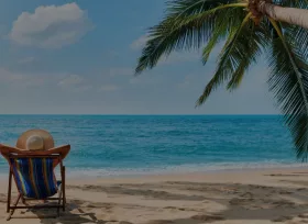
I think a hero or banner images purpose is to elicit an emotional response. It’s meant to be eye candy to represent your company and leads to an interaction. Be mindful that your photography choices are authentic and match the brands personality. On lower budget projects we use royalty-free stock images and try to make them more unique by using Photoshop rastered filters or css filters to create a cohesive look for the photos on a website. This is a great strategy for also making text more readable, be it a sepia tone, grayscale or gradient overlay.
Be mindful of how you crop images, consistency in the angles, close or wide crop and light sources. These subtitles make a design feel well thought out without cognitively recognizing it.
Typography

Fonts have their own personalities, and choosing ones that match the overall style of your site is a matter of finesse. Ideally start with the logo and choose fonts that compliment it. Typography can also make or break a good web design. You want to match the tone of the overall brand theme, making font choices that reinforce the overarching desired first impression.
Some general guidelines:
- Good typography design is a line between an aesthetic and decorative role and ability to easily read copywriting.
- Adjust line spacing for different screen widths, the wider the text block is the more line spacing you need to be readable.
- Be mindful of your audience demographics, a tiny font may look cool to you but if your target audience is over 40 they probably won't be able to read it.
- Use color on fonts sparingly and consistently, some colors make text very difficult to read, unless it’s a hyperlink try to not use more than one color on headings for corporate websites.
- Thin weighted sans serif fonts feel modern whereas thicker serif fonts feel established.
- There are thousands of unique display fonts, many can be used to create interesting combinations, but be judicious.
- Find a copywriting font that has multiple weights and italics, but like the color palette limit the usage and maintain consistency in your headings, copywriting and text elements.
- You can develop a unique look and feel by adjusting headings with css letter spacing.
- Bold fonts are great for headlines and should be used sparingly, you don't want to be screaming at your visitors, but as headings you can be very creative.
- Choosing pairings from serif to sans-serif, display and script fonts. Display fonts can work well for larger sized headings, but generally do not have variants and weights for other purposes.. Sites like Typewolf can help with choosing font pairings, these guys are fontophiles.
- Use real text instead of embedding text in images where possible, there’s lots of creative CSS for transforming text, and it’s much better for scaling responsive views and SEO.
Graphics and Icons

Modern website design consists of many ingredients and technologies, but what the end-user sees are a mixture of text and copywriting, photos and illustrations on their own screen. This third ingredient I’m referring to as graphics and icons, these can be both decorative and informational, anywhere from serving a purpose of a road sign to replacing photos with artistic illustrations. Much of website design is working with multiple artists with unique disciplines and the web designer puts it all together to make an interactive, usable, goal-oriented and ‘living’ design that can scale over time.
If you are designing your own icons and have the budget, you would want to include a sample of the style, and be sure you can repeat it throughout the site. You may also want to include samples of infographics, tabular data, buttons, callouts styles and other graphical design patterns.
The current trend for illustration and iconography is “flat-design”, a minimalistic design approach that emphasises simplicity over realistic illustration. While it’s great to be a trend setter and break the mold, you don't want to design new icons that look like they’re already outdated. When implementing new graphics, if you're using vectors try to keep them that way by exporting as svg’s if possible, they will appear much sharper and in most cases be a smaller file size.
Extra touches
The use of subtle movement via javascript or css animation can take your website design to the next level. Whether you have the resources to create animated images, be it interaction (hover, click, scroll-based, timed, etc) I personally do not like to go overboard with elements moving around or appearing, but if executed with intention, this addition can be something that will create that wow factor. As a designer there’s plenty of tools that can help create or communicate the desired animation effect to your client and team. We recommend working with an interactive developer to optimize any kind of animation as there are countless libraries, frameworks and techniques that need to be vetted for any website.
Back 10-20 years ago the “Wow” factor was Flash, today it’s a culmination of so many factors. One of these used to be nearly impossible due to bandwidth and speed, was the decorative use of video. Today video loops can replace a static hero image and if executed properly can be much more inspiring than a flat photo. Always have a loader image fallback photo when using video.
Last suggestions, take the time to style all your GUI elements and create a cohesive look for all your widgets and gui elements. Using a boilerplate framework or plugins styles is easy, but it’s probably going to look out of place, take the extra time to ensure all elements are accounted for, styled, tested in multiple browsers and devices and polished up to shine.
Ready to make a great looking website for your business?
Fill out the contact form below to get started on a custom website design proposal. Aktiv Studios in Atlanta, GA will make your next web design project a masterpiece.